In what ways does your media product use, develop or challenge forms and conventions of real media products?
My media product corresponds and coincides with typical products in the section of the media i.e. music videos. The typical conventions of our genre are shown according to our chosen genre, which is folk/ acoustic. Looking at similar artists such as Katie Melua (www.katiemelua.com) and Norah Jones (www.norahjones.com), they incorporate similar themes, such as nature or emotions. They use subtle editing techniques such as fades, soft focus and long takes. In order to keep close to the genre and to keep it recognisable we had to use typical conventions. A lot of the music is closely linked to nature and peace, so we have to incorporate that as well. Therefore a lot of the Mise en scene includes trees, fields, animals etc.
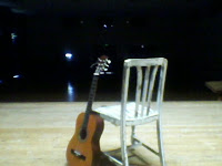
Musical Synaesthia is important in our genre, as want the audience to the feel that the music is genuine, and was actually written and performed by the artist; therefore our reverse cover on our CD case has a guitar resting on an old fashioned chair, on a stage with a black background. This challenges typical conventions of a concert, because most concerts have an audience at a fairly large venue, and because no one is in this tableaux, it gives the impression that she is a fresh, new and not well known artist.
The camerawork in most music videos of this genre is very minimal of movement, this is because the audience are on the fancy tricks, they are just looking for and listening to the music. We have kept this idea as not only does it make it easier for us during the editing process, it also means that it is easier to watch and it calms the audience down, which is that the music is supposed to do.
Our music product doesn’t really follow any theorist’s perspective because there is no example of voyeurism or exhibitionism. This is therefore challenging what is typically in a music video, although it probably isn’t the genre that theorists are focusing on. The only exception is Goodwin; despite his opinions on voyeurism and exhibitionism, most of his theories apply to our genre. Many of the videos from our genre use close ups to show emotion and that the Mise en scene will enhance the overall look of the video. We showed emotion in our video with a high angle shot of the artist looking down. This makes her look weak, vulnerable and fragile. We did this because she's remembering her ex-boyfriend.
Overall our music and digipack reflect most of the usual conventions in real media products. Our camerawork and editing are closely related to our chosen genre. The lyrics match the video’s Mise en scene giving a feel on synaesthia with the use of lip synching and guitar playing. The tempo links in to the editing and genre to give the audience a calming effect, as it is used on many videos of this genre.
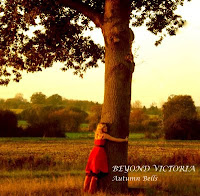
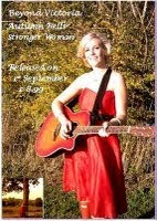
These are examples of using these typical conventions for our product. By using the typical themes of nature, we have used this to our advantage by actually following these conventions. The tableaux in the middle is taken from our music video, and the other two are the booklet pages. We can see that here, the artist is in natural surroundings, with her guitar to give the impression that she is actually playing it.We included these also in the poster to accompany the CD with booklet. The poster has been designed to be set up in a music shop window to attract the attention of the consumer. We included on the poster details about the release date, the new single, price and the image of the artist, in order to let the audience know and identify who the artist is, and can therefore denote what kind of genre she is going to be by the Mise en scene used. The CD cover also links into the nature theme, as it portrays the artist hugging a huge tree. This can give the audience the impression that she loves being outside, and wouldn't be related to any sort of harm.
How effective is the combination of your product and ancillary texts?
My ancillary task ended up not being what I originally envisaged, which was an Indie/Rock band. My plans for an Indie/Rock band gave us the benefit of what shouldn’t go into a folk/acoustic artist, such as lots of new technologies, recognisable people etc. It also allowed us to take away some ideas from other genres and marry the two together, for example pop, which sometimes uses a cartoony feel to the video, making it feel make believe. This therefore, challenges conventions. We too the stage idea and used it to our advantage by making it fit the genre by the Mise en scene. By using an old fashioned chair we can give a retro look to the picture. This idea links to the Indie/rock genre by the picture taken up on stage, one similar to that of a folk/acoustic artist.
This also allowed us to make comparisons and bounce ideas around. We looked at each others ideas and it seemed that the theme was generally feminine theme. The ideas for the CD covers included fields, clouds, horses and that sort of thing.
One of the questions that was in the short questionnaire that was handed out after the private screening (in the next section) was “would you see this artist at a gig/ concert?” This allowed to the people at the screening to decide whether or not they would actually go ahead and choose to listen to the artist, just based on the video, CD cover and poster. They majority of them said yes. Not only does this mean that we correctly identified our target audience, it means that our items worked well together. This could not have been done without the ancillary part.
What have you learnt from your audience feedback?
Before we started to plan what we should be included in the content of our music video we needed to assess who are target audience was. The age range turned out to be 25-50 years old and preferably female. We learnt this from going to www.youtube.com and looking up artists that would match the specifications of ours. By clicking the link entitled “Statistics and data”, we were able to determine what demographic our audience would be. After we got that information, we needed to learn the psychographics.
We set out a number of questions of which to go into it. Instead of making the questions have yes/no answers, we made sure that audience would have to do a bit of creative thinking, instead of just filling it in for our sake. This meant that we could pin point that audiences preferences and what they wanted to see in a music video. We discovered that the audience tended to go for nature themes, as it is calm, easy to listen to, and they are able to appreciate the music, instead of listening to it because it’s popular.After looking and analysing the given data, we had to interpret it into what we should put into the music video. We examined the several music videos that linked back to our ideas. The 2 main artists that popped up were Katie Melua and Norah Jones. We examined the comments made on the videos, and discovered that the expectations given there, were almost identical to those we researched. This was an obvious sign that the record producers for both Katie Melua and Norah Jones knew what had to go into the video, the CD cover and poster to accompany. It seemed that the audience didn’t want a really flash video with lots of effects, but with colour, soft focus and smooth transitions. These effects can calm the audience down, especially with the addition of music, which is definitely not meant to be erratic or crazy.
After production, our video was showcased. We were told that there was one shot that was particularly shaky, o we went back onto final cut express and slowed it down, keeping in mind to keep it the same length of time that the original cut was, not only to keep the cuts to the rhythm, but to also make sure that the lip-sync was back to the way it was.
After we completed the video and digipack, we had to present it to our target audience. The keep with the theme, we sent our about 35 copies of this letter (show letter) to a random selection of teachers. We included a couple of males to give feedback from a different perspective. The letter was meant to based on typical Victorian handwriting, as I had learnt how to compose a letter in the 19th century style. This gave the letter a feminine effect. After the viewing of both the music video and digipack, we politely asked the brief questionnaire to give feedback. The reason as to why is was brief is because people’s attention span nowadays is very short, and we didn’t want them to spend an hour doing a lengthy questionnaire. After the results were collated and analyse we confirmed that the majority of the music videos criteria matched the audience’s psychographics.
How did you use new media technologies in the construction and research, planning and evaluation stages?
During the research stage of our product, we had the advantage of using computers to our advantage. We were using the most revolutionary computer available, which doesn’t have a tower which houses the hard drive and CD drive; it’s all housed in the monitor which means there are no excess wires. My only comment is that it was an Apple Mac, which aren’t the most user friendly.
Storyboarding didn’t use media technologies, as we just used pieces of paper. That went for everything before we started to look at audience research. Our ancillary task used pieces of A3 paper.
When it came to audience research, we had the entire internet at our disposal. We started with YouTube. Using it gave us a good idea as to who our target audience was going to be, and what sorts of things were necessary in a typical music video of our genre. We also looked at the forums. Looking at www.katiemelua.com and www.norahjones.com we were able to look at what the audience of real media products liked, disliked and commented on. YouTube helped again with determining the demographics of the audience. Taking for example Katie Melua’s “9 million Bicycles” http://www.youtube.com/watch?v=DTy3WA0Pq8M we looked at the “Statistics and Data” link to find that the majority of her audience were female. This made sense, and they could probably link to the emotion that she portrays. This was important to the research as we could now use that that information to include things that would interest the female market.
In order to find a suitable song, YouTube wasn’t going to be good enough, so we used a site called www.jamwave.com. This site specialises in unsigned artists, as the exam board stressed that this was key, and that we couldn’t use any existing songs by signed artists. This meant we had to use the internet to find artists. Using JameWave, we came across artists that matched the genre of “folk/acoustic”. It came up with a list of songs and artists that matched the specifications. We came across this artist called Sydney Wayser. She had composed a song entitled “carousel”. We thought this would be a good song, as it had a circus type riff, and we could work with the circus theme for our video. But as we discovered more about her, we found out that her song already had a music video to it, so we probably would have been going along with the conventions of that video, and not to our own design. So we had to come up with another song. Suzy eventually found a song composed by a friend. She contacted her through Facebook, a social networking site, and sent her the song “Stronger Woman” as an mp3 file. This was our song.
After we uploaded our footage using the "Capture" process on Final Cut Express, we used this program to edit it. By using the razor tool, we could cut down the footage a considerable amount, and by cutting the shots to match the rhythm of the song, it established the video to be smoother from cut to cut, as the music would hide it, and it gave the video more fluidity. By using transitions such as "dissolve-additive", it allowed us to jump from scene to scene, with the link between both of them, which helps the narrative. I used editing techniques in order to achieve effects such as a man disappearing from the frame. By taking two pieces of footage and trying to make it so there are two cameras operating at the same time. We used this particular effect when the artist is cycling over the bridge. This gives the impression that she is cycling over the bridge at once, and not actually going over it twice.
We used "iDVD" to create our menu, and we chose the brush effect as the background is a natural colour of brown, and the brush makes it more feminine. We selected only a short part of our song to be repeated on the menu screen, as to not render the video clip link totally useless. We made so many mistakes after burning the DVD, had to use 5 discs before we got the correct one.
In order to make our ancillary texts look the part, we used the program Photoshop. Initially, using it was quite tricky, as wee needed to air brush out some telegraph poles, as they did not suit the Mise en scene. We selected the image we wanted to use, and we cut it down to a square, as it would match the dimensions of an actual CD cover. We took the reverse cover shot with my mobile phone camera. By setting up the scene and blacking out the background, we used Photoshop again in order to give it a retro look. It also inadvertently made the black parts look blacker, and even made the bits of lights seeping through the curtains look like stars. We added the same font text as the front cover, and came up with an entire list of songs that could have been on the real album. We also added a barcode in order to make it look like it should be on the shelf of a music store.
Disc Cover was the program we used to made a fake CD design. The nature themes were used in this, so that the the entire CD package all linked back to one motif, nature. We wanted to use the image of the artist looking to one side, as if we had just taken a picture of her without her having previous knowledge.
I found Photoshop to be tricky, as the Mac's setup was still very awkward and it took a long time to get things the way we wanted. However, we carried on and we got the result we wanted in the end. In the poster, we took the CD cover an included it in the frame, so it would actually let the audience determine which CD they were looking for. We used all the same tactics for the poster that we used for the CD cover, however we made the dimensions suit a poster, which was a rectangle. By using Photoshop, we added details such as price, release date and they artist's single.


No comments:
Post a Comment